How to Choose Branding Color Palettes for Your Startup
Colors in Art History
Color is one of the essential elements in art and design. Throughout history, it has been used to depict emotions, delight audiences, and change how we see the world. Artist Pablo Picasso used different colors intentionally and exclusively to express feelings. Painter Paul Cezanne led the Post-Impressionist art movement by reinventing how color is used in landscape paintings.
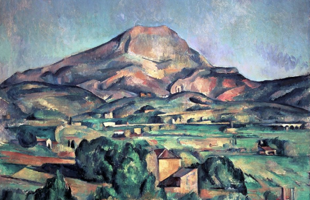
img: Paul Cezanne’s impressionist landscape paintings had a revolutionary way of using color. Source: wikipedia
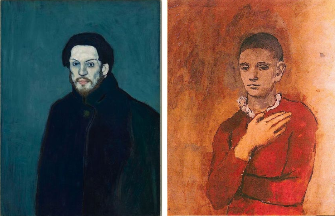
img: left–Picasso’s blue period; right–Picasso’s rose period; Source: wikipedia

img: Artist Yves Klein invented his own shade of blue called IK Blue. Many brands later started using this blue and It became a popular fashion trend. Source: invaluable
If it hasn’t crossed your mind, different colors have different meanings. Whether it’s landing pages, products, branding, social posts, choosing and using colors effectively can help your audience recognize and remember your brand.
Primary Branding Color
What is a primary color?
Primary color is the main color that is used on marketing graphics, website, signage. Typically, this is the main color that is associated with your brand. For example, the primary brand color for Coca cola is red.
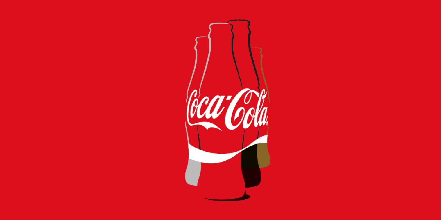
img: you will find this classic red in alot of coca cola’s branding. Source: Fastco
How do you find the right color?
You can find the right colors through research color palette usage and inspirations. There are a couple of approaches you can take:
- Look at what similar brands in your niche are doing.
- Research about what values colors are associated with.
- Create mood boards of things or values inspired or associated with your brand. I wrote more about this process here. You can then sample colors from images in your mood boards.
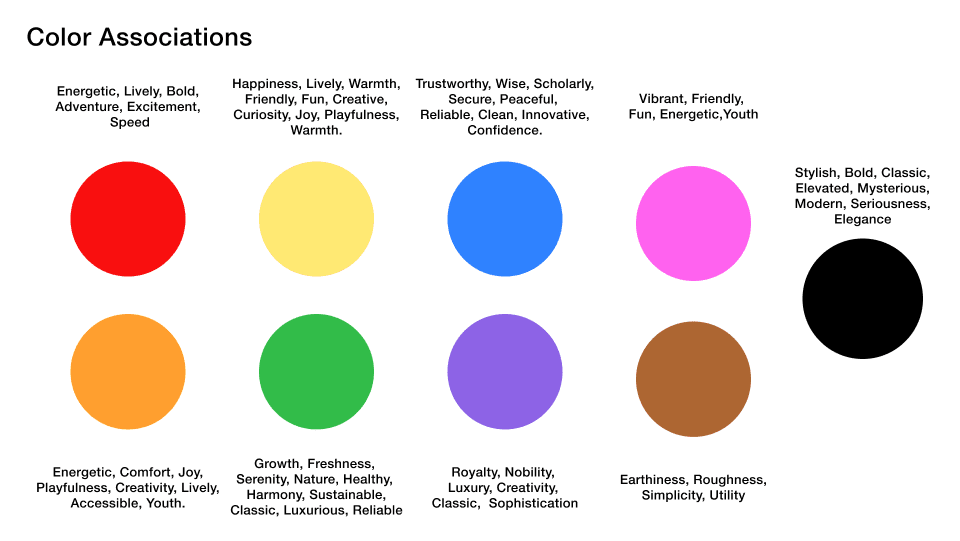
img: a simple chart I made of colors with their common associations.
Once you find a color that resonates, it is essential to test it in the environments you will be using. You also want to test how this specific color performs on black and white backgrounds. This test tells you if the color you are using is too vibrant or too dark. You want to make sure it is legible and visible. If you are using it in product packaging, test it out printed. Checking colors is simple, and it saves you time down the line.
Secondary Color
Some brands have a few colors they use consistently along with the primary brand color. These colors are called secondary colors. A secondary color is not a requirement for branding. However, it is nice to have to highlight or complement a primary color. It provides more ways to add recognition and distinguishment to your brands. While there isn’t a rule on how many secondary colors you can have, you should try to limit yourself to about three or four so the brand remains recognizable, and the message remains clear. Having too many colors can be distracting and confusing. You should always use one color as the primary.

img: Ikea’s color palettes using blue as the primary color, yellow as as secondary color; source: dazeen
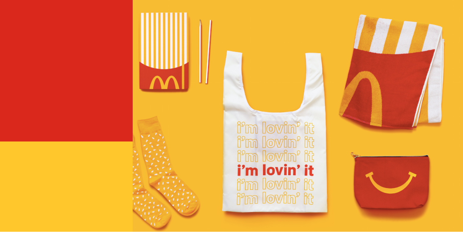
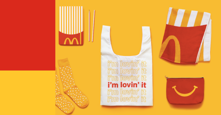
img: McDonald’s color palettes using red as the primary color, yellow as as secondary color; source: AdAge
How to pick a secondary color?
There are several ways you can pick your secondary colors.
As a starting point, you can think about:
- Is there another color you liked when you picked the primary color?
- Is there a color that pairs well with the primary color?
Color Pairing
Combining color can be tricky. Consider these ideas when you are combining color for your projects.
Monochrome
You can get various shades of a color by playing with the saturation and lightness of a color.

img: monochrome web design; source: onextrapixel
Accent
An accent color is a color used in small amounts to highlight or add visual punch to the primary color. An accent color is usually a bright color.
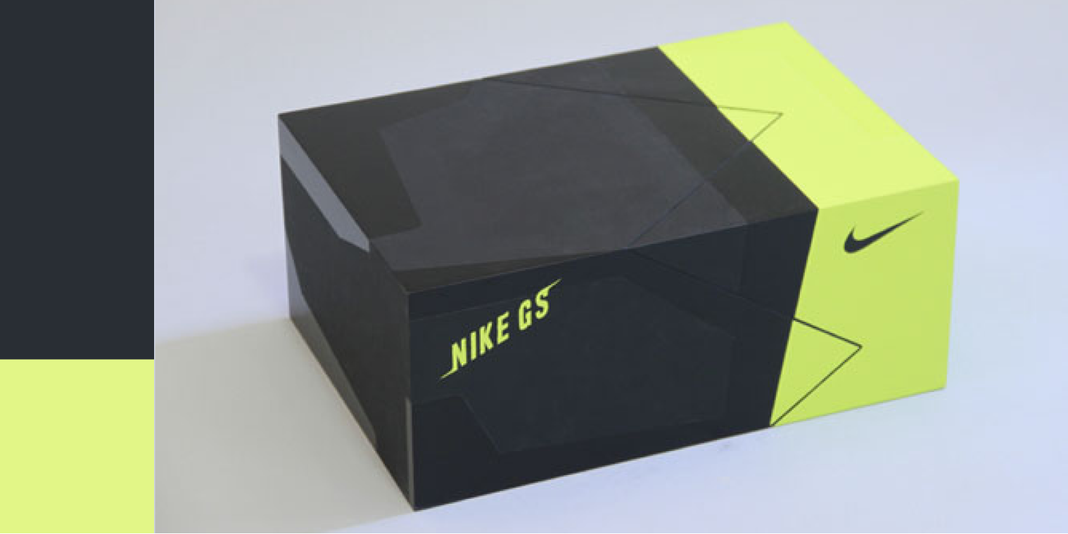
img: light yellow is used as an accent color in this Nike packaging; source: NirvanaCph
Grayscale
Grayscale is the range of shades of gray. The highest level of grayscale is black, and the lightest level is white. Grayscale is useful because gray shades work well as complementary colors and make the colors pop.

img: greyscale is used in this museum website; source: inselhombroich
Additional Tips
1. Stick to your logo colors
Do
Having a primary color people associate with your brand is a good idea.
Don’t
change your brand colors
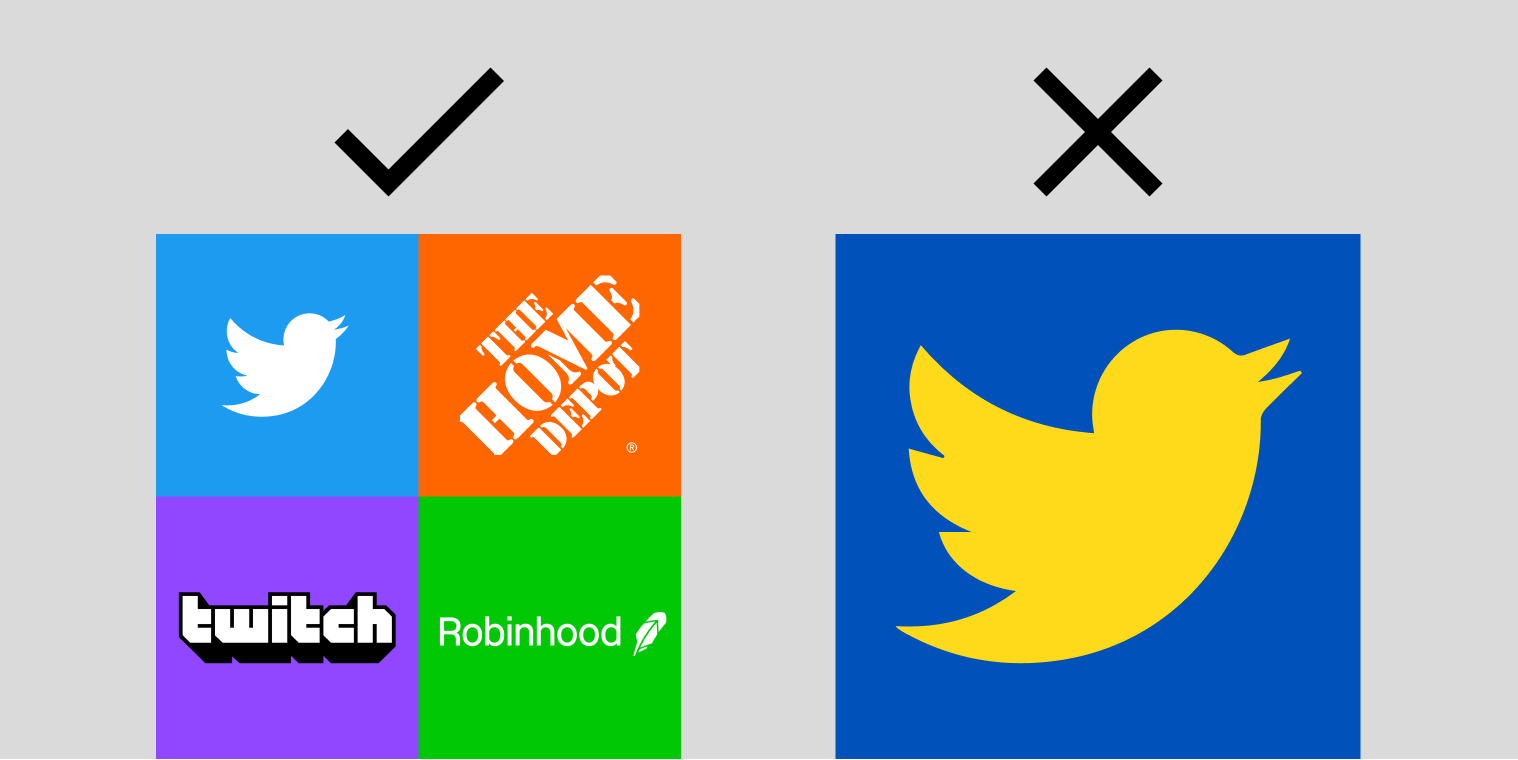
img: do and don’t for logo color
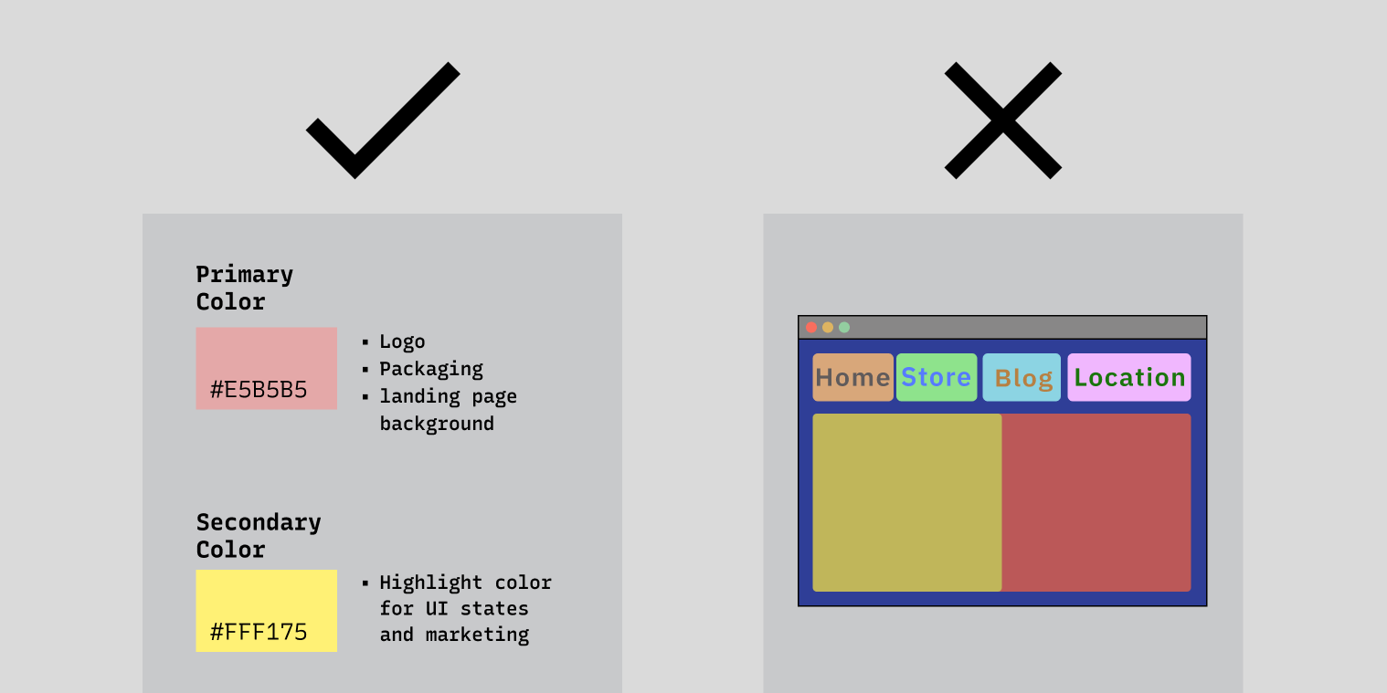
2. Make up a system for using colors & stick to it
Do
Be consistent about which colors to use and for what
Don’t
Wing it- use colors randomly and have no rules
img: do and don’t for color usage
And that’s it for our guide on choosing colors! Do you have any additional questions or suggestions? Let me know via Twitter @typogramco